Category Archives: A few things…

General comments and information on current projects

Spring has arrived! …we hope.

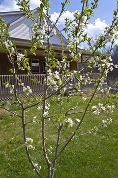
Spring has finally arrived in northeast Ohio—at least we hope so. It could be toying with us. But so far the signs are good. The spring peepers have been chirping in the woods along the creek for a couple of weeks and last week the Trout Lily sprouted up, seemingly from nowhere, and bloomed followed by a succession of other delicate wild flowers. Over the weekend our cherry trees all blossomed—even the Compact Stella that had never bloomed in the five years since it was planted.

I get a little nervous when the cherries bloom. They tend to be overly optimistic. But this year they ignored the couple of warm days we had in March and even the warm weather at the beginning of April didn’t disturb their winter sleep. They even took their time opening up when the temperatures hit the mid seventies last week. Only when it got into the eighties over last weekend did they finally decide it was time to wake  up. The mason bees and bumble bees have been busy working on them for several days now, so hopefully they will have a chance to set their fruit before any late frost comes along to burn the blossoms. I’m looking forward to a tasty summer.

Trout LilySpring wild flowers

Spring flowers

Stella

Poster Project Pulls Pupils to Panoramas

Since the fall of 2003 I’ve been teaching a course in panoramic photography at Lakeland Community College in Kirtland, Ohio. In the early years, it proved difficult to attract enough students to register for the course. Because it is an elective, there is no guaranteed pipeline of students who must take the course to complete their degree requirements. We also discovered that there was generally a very low level of awareness among students of the very existance of panoramic images and a lack of understanding of how making panoramas could influence and improve their experience of photography in general.

It was clear that listing the course in the academic catalogue and making announcements in other photo classes to encourage students to register for the course was not adequate to generate the interest level needed to fill the class on a regular basis. In 2005, I began making large format prints of some of the more interesting student work and posting them on the walls of the imaging lab, the hallways outside the photo lab and anywhere else we could find some wall space. This helped, but we still had to cancel a class because enrollment fell one student short of the minimum. So, in the spring of 2006, I began creating a series of posters using student images and a soft-sell sales pitch to try to raise the awareness and level of excitement about this course to the point where we could count on filling one class each semester it was offered.

The project proved very successful in attracting many of the best photo students as well as those whose interest leans more to the electronic imaging aspect of the process. Students who have completed the course have been widely recognized at the annual student art show in the Lakeland Gallery and the course is nearing the level of a “must do” for most of our more serious students.

Below are images of the four posters that have been designed so far. Each is 28 inches wide and features an image created by a student who completed the course in the previous semester. While there are many exciting images produced by each class, I have always selected an image from the most recent class because the creator of the image is more likely to be familiar to the next group of students. I think it’s more motivating if prospective students can talk to a current or former student directly about their experience in the class. The poster image, complete with credit line and copyright notice, encourages that kind of interaction.

Each poster also includes a three-word slogan or tag-line. My hope is that students will begin to look forward to the next poster, wondering which image will be chosen and what the tag-line will be. Where wall space is available, we have left posters from previous semesters in place so that students will see all the images and read all the tag-lines.

#1 — image by Adam O'Neill

#1 — image by Adam O'Neill

#2 —image by Alex Slitz

#2 —image by Alex Slitz

#3 —image by Anna Zimmerman

#3 —image by Anna Zimmerman

#4 —image by Aaron Schramm

#4 —image by Aaron Schramm

Digital Camera Review

Last week I had an opportunity to do an extended test of the new Canon EOS 5D Mk II digital camera. This is Canon’s latest “entry-level” professional DSLR camera body featuring a full-frame 21MP imaging chip, the latest DIGIC 4 image processor and built-in motion picture and sound recording capability to produce video in 1080p high-definition format. This camera had been the topic of speculation for almost a year prior to its introduction last October and has been a hot commodity in the marketplace with the supply of actual cameras just now beginning to catch up with the backorders.

To say I was overwhelmed by the performance of this marvel of modern photo technology would be putting it…well, wrong. Yes, the 21MP CMOS chip makes very large images (5616 X 3744 pixels) and the low-noise amplifiers allow respectable image quality at ISO 1600 or better, but, for me, the camera has two weaknesses that make the $2700 price tag seem way beyond what I would want to pay for such a beast.

First, the camera body does not seem all that sturdy mechanically. Let me emphasize that this is an impression not a documented statement of fact. I’m comparing this to the Canon EOS 1v 35mm camera body that I’ve been using for the last nine years. When you trip the shutter of the 1v, it feels solid—no vibration, no rattling, nothing shaking around inside. It also sounds solid—just a rapid series of soft but sharp clicks as the mirror swings up, the shutter opens then closes and the mirror returns to the viewing position. When you trip the shutter on the 5D Mk II, you hear a rapid series of ringing and chugging sounds that, while they are not loud and don’t sound like anything is breaking inside, they just don’t have the smoothness and solid sound that I’m used to hearing from my camera body which cost a thousand dollars less than the 5D. Will this camera have similar durability to the EOS 1v if used in near zero degree temperatures, driving rain or the heat of a desert? Only time will tell. Pay your money and take your chances.

The second problem I see with this camera is, unfortunately the result of one of its great strengths. The imaging chip is just a hair shy of the format of 35mm film making room for millions of extra pixels and allowing more space for each pixel site on the chip compared to the APS size chips that have been the mainstay of DSLR cameras for several years.  This results in lower noise at any given ISO setting. That’s one reason why this camera can make acceptable images at ISO settings of 1600 and above. Its maximum setting is 25,600! However, with a chip this large, the light reaching the corners strikes the chip at an angle rather than coming straight in perpendicular to the chip surface. This causes some optical diffraction as the micro lenses that cover each pixel site on the chip are designed to accept light entering directly from the front. The result is that images have some very noticeable misregistration of red and green near the corners of the image. And this misregistration is different with each lens that you use.

This red/green offset can be corrected in RAW file processing software such as Adobe Camera RAW, but you need to set up the correction for every lens that you use and save that correction as a preset so that you can apply it to each image before processing your RAW files into TIFF format or whatever you need for printing or publication. I used a Porta-Pattern black and white checkerboard/resolution chart to check three different lenses and found that each lens required a different amount of correction to remove the red/green offset, so I had to make a Camera RAW lens correction preset for each lens. Oh, and by the way, zoom lenses may require separate correction settings for different focal lengths throughout its range. My 17~35mm f/2.8 EF L lens required different settings for 17mm, 24mm and 35mm focal lengths.

Imagine shooting 200 images with four different lenses and then having to remember which lens correction preset to use in Camera RAW for which images. You would need to check the file info metadata to be sure you chose the correct preset for each image. Mistakes will be made.

In all fairness, this red/green offset is an OPTICAL phenomenon which is caused ultimately by the design of the lens and the chip as an optical system. Large format lens manufacturers such as Schneider, Rodenstock and Zeiss have dealt with this for several years now by designing special digital lenses which have large rear elements that can project light rays to the image plane so that the rays reaching the corners of the chip fall almost perpendicular to the chip surface. Moreover, large format lense are designed to project an image circle large enough to cover film formats of 4 X 5 inches and beyond. So the small area of even the largest imaging chips in use today is pretty much a piece of cake for a lens that covers an image circle that’s 15cm or more in diameter.  Designing such a lens to fit into a DSLR camera body would be very costly, if it could be done at all.

So, is the EOS 5D Mk II a bad camera? Certainly not. It will do things that would be difficult or impossible to duplicate with other equipment. Would I use it for my professional work. Well, only if the client’s expectations could not be met with my current equipment and ONLY if I had at least one back-up body AND a budget for post-processing of the RAW files. Is it worth the $2700 price tag? You can spend your money however you want.

More STEPS

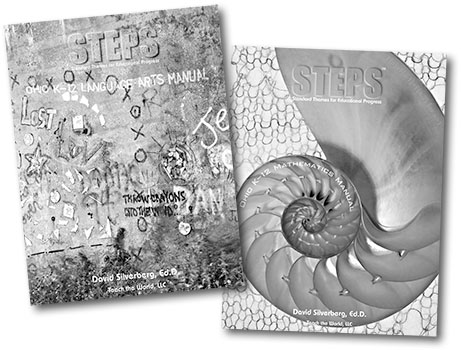
Back in October and November we produced two additional cover artwork designs for David Silverberg’s STEPS publications. The Language Arts Manual used a photo of graffiti by Laura Balliet. She found this interesting collection of “Language Art” under the Detroit-Superior Bridge in Cleveland. Some fine-tuning in Photoshop made the graffiti text stand out a little better and a graffiti-like typeface was used to add the title.

Laura made an original photo for the Mathematics Manual. We purchased a sectioned nautilus shell which she photographed against a backlit, hand-woven cloth. The nautilus shell was selected for this image because its spiral shape follows the pattern of the Fibonacci sequence of numbers in which each number greater than one in the sequence equals the sum of the previous two numbers. We thought math teachers would get a kick out of it.

STEPS redux

The second in the series of STEPS teacher manuals, the Ohio Social Studies Manual, is complete and is on its way to participating school districts. This cover design features a composite image of two photographs by Laura Balliet.

The two photos are very similar. Both are compositions of the curved stone staircase on Martin Luther King Blvd. in Cleveland. The blurry figure decsending the stairs was present in both images, however I thought the composition of one offered a better view of the staircase, whereas the position of the figure was better in another shot in which the steps at the bottom of the frame were hidden because the camera position was slightly more to the right.

It was a fairly simple process in Photoshop to combine the best of the two images into a single composition. The stencil-like title was added by using the underlying image itself as a displacement map to give the text a texture that matches the texture of the stone. As a final touch, this text was warped to give the baseline a slight curve similar to the curve of the wall.

Recent project

Over the past few weeks I’ve had the pleasure of working with fellow photographer Laura Balliet on a book publishing project for a start-up company called Teach The World. Back in the mid-nineties, Laura and I worked together on numerous projects for University Hospitals of Cleveland and it has been far too long since we’ve had the opportunity to collaborate on a new project.

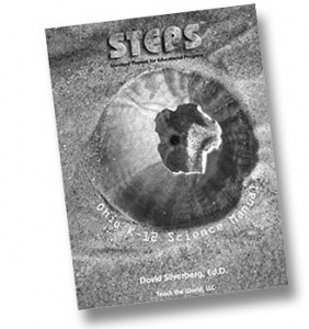
Teach The World is developing a series of publications called Standard Themes for Educational Progress (STEPS). STEPS is a series of educational manuals for teachers in Ohio public schools, grades K—12 which organize the state Academic Content Standards into unifying themes or STEPS. I designed the cover for the first volume, the Ohio K—12 Science Manual, which features one of Laura’s photographs, a still life of a clamshell embedded in beach sand.

The second volume in the series, the Ohio K—12 Social Studies Manual, is being designed now and should be completed next week. Both of these books are planned to be updated soon with more extensive use of photography and other graphics.

Publisher, David Silverberg, with the help of a team of teachers and school administrators from the Ashland City School District in Ashland, Ohio has done a masterful job of organizing and prioritizing the content for each manual which serves as a unique guide to teachers in developing lesson plans and classroom activities to work toward providing students the knowledge they need to excel on the state proficiency tests. As an educator myself, I believe there are serious problems in the proficiency testing as it is currently constituted, however a tool that helps to organize content and show the progression of knowledge along a clear line of development should be welcome in any classroom.